
.avif)
.avif)
Browse all articles
Most landing page optimization conversations sound the same: tighten the headline, reduce form fields, add social proof, improve page speed.
All of that matters.
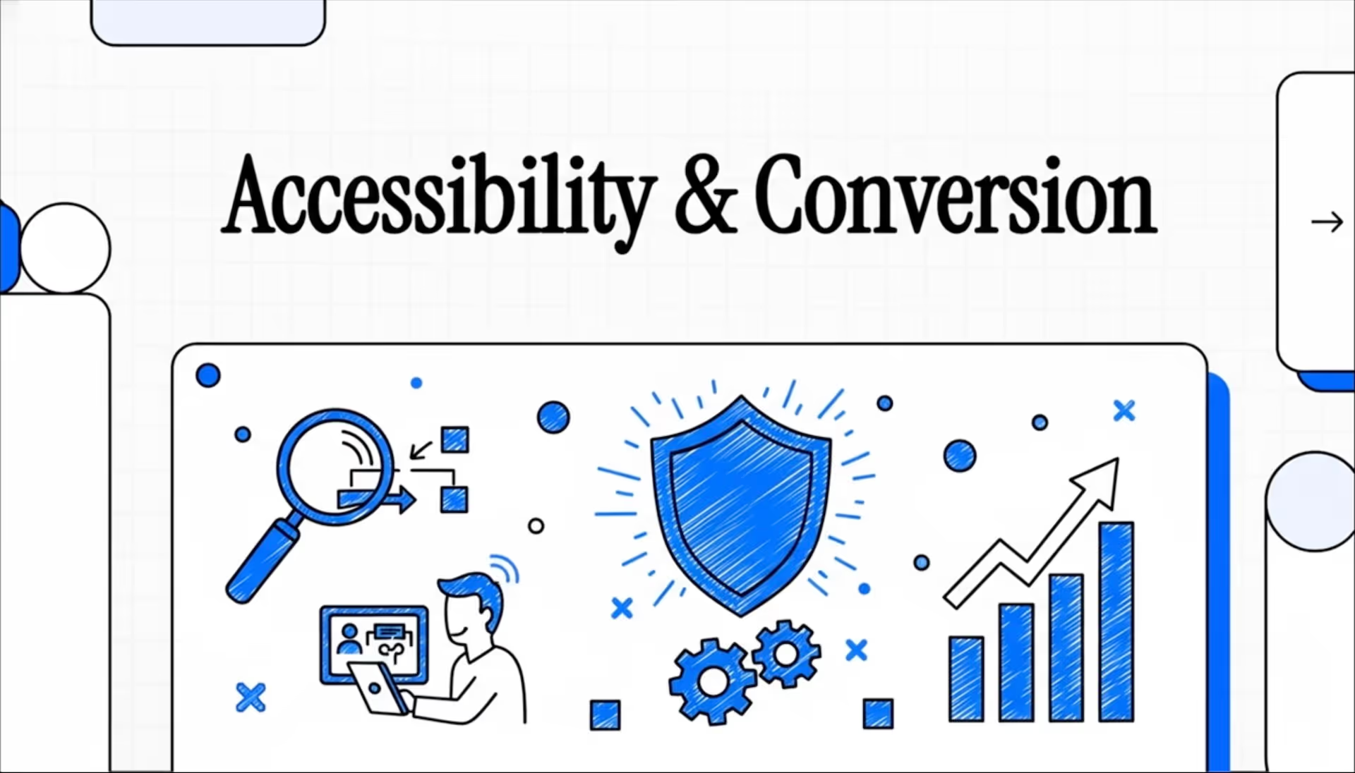
But there's a quieter conversion problem that doesn't show up in your A/B test notes until it's already costing you leads: landing page accessibility.
If someone can't tab to your form, can't read your low-contrast text, can't understand your error state, or can't use your CTA with assistive technology—they're not "choosing not to convert." They're being blocked.
And the bigger point: when you fix those issues, you don't just help a small edge case. You usually make the page cleaner, clearer, and easier to complete for everyone. That's why website accessibility is one of the most overlooked forms of conversion optimization.
Website accessibility isn't a "nice-to-have" audience segment
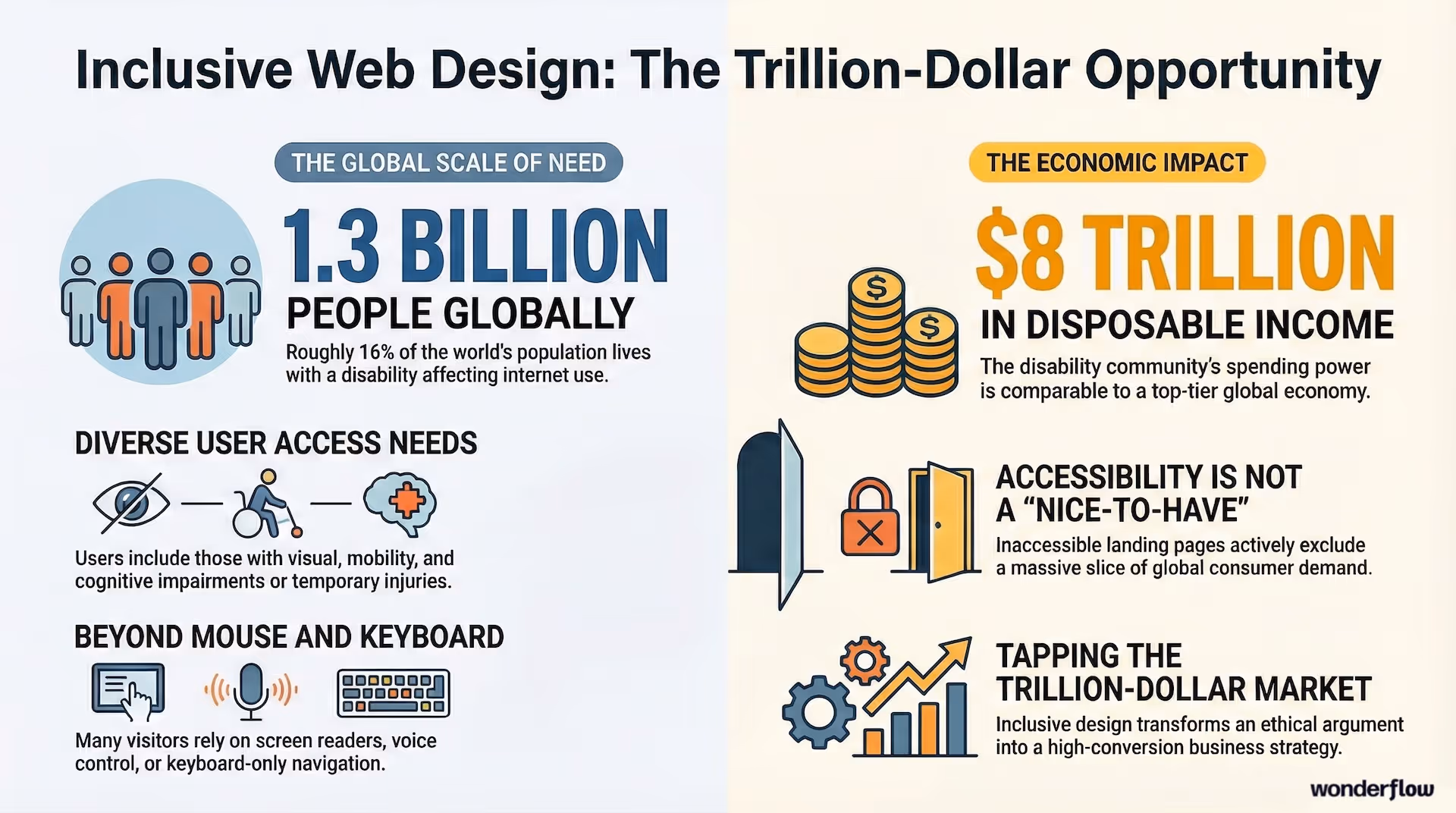
Roughly 1.3 billion people—about 16% of the global population—live with a disability that can affect how they use the internet. (Source: WHO) That's not a niche. That's an entire market.
Even if your product isn't specifically built for the disability community, your landing page visitors absolutely include:
- People with low vision, color blindness, or light sensitivity
- People navigating without a mouse (mobility limitations, injuries, temporary constraints)
- People using screen readers, voice control, or keyboard-only navigation
- People with cognitive load challenges who need clarity and predictable layouts
And this isn't just an ethics argument. There's real spending power behind it: the disability community is estimated to represent about $8 trillion in disposable income globally—large enough to compare to a top-tier economy. (Source: Return on Disability)
If your landing page isn't accessible, you aren't "missing out on a few conversions." You may be excluding an entire slice of demand.
The data is blunt: most sites are failing basic web accessibility standards
Here's what surprised me when I started digging into this.
According to the 2025 WebAIM Million report, 94.8% of the top 1,000,000 home pages had detected WCAG 2 failures.
That means the default state of the web is inaccessible.
So if your landing page accessibility hasn't been intentionally designed and tested, odds are you've got blockers sitting inside your funnel right now—especially in forms, CTAs, and navigation. If your ads are driving traffic to a page with hidden accessibility barriers, you're paying for clicks that can't convert.
Accessibility and conversion rates: why the lift shows up even for "non-disabled" users
This is the part marketers underestimate.
Accessible landing page design is basically friction reduction:
- Clearer content hierarchy (people can scan faster)
- Stronger CTA language (links and buttons make sense without surrounding context)
- Better form completion (labels, errors, focus states, confirmation)
- Fewer surprises (no autoplay, no sudden context changes, no keyboard traps)
- More readable design (contrast, spacing, text sizing)
Those improvements often map directly to conversion metrics.
One case study from Natural Intelligence reported that after implementing accessibility improvements, earnings per click rose 2.4% and earnings per visit rose 3.5%—alongside a bounce rate drop. (Source: AccessibilityChecker.org)
That's the accessible design conversion argument in a single line: accessibility doesn't just expand reach—it improves performance.
It's not only about conversions: ADA website compliance and lawsuits are rising
If you operate in the U.S., you've probably heard the phrase "ADA website compliance" tossed around without clarity on what it actually means.
At a high level: ADA Title III covers "public accommodations" and has increasingly been applied to digital experiences—including websites and apps—with WCAG commonly used as the practical benchmark for accessibility expectations.
And the legal pressure is not slowing down. More than 5,100 digital accessibility lawsuits were filed in 2025, roughly a 20% increase from the prior year. (Source: accessiBe) UsableNet's midyear data tells a similar story, with a 37% surge in filings during the first half of the year.
If you run paid traffic to landing pages—especially for ecommerce, education, healthcare, finance, or anything consumer-facing—ignoring accessibility is both a revenue leak and a risk decision.
WCAG compliance (WCAG 2.2) explained like a marketer
WCAG is the dominant set of web accessibility standards used globally. The current widely referenced version is WCAG 2.2, which became a W3C Recommendation in late 2023.
You don't need to memorize the spec. You do need to understand what it means in landing page terms:
- Can users perceive the content? (contrast, text, captions, alt text)
- Can users operate the page? (keyboard navigation, focus states, no traps)
- Can users understand the page? (clear language, descriptive CTAs, helpful errors)
- Is the page robust for assistive technology? (labels, semantic structure)
If you get those right, you're well on your way to meeting practical WCAG expectations—and improving conversions at the same time.
The accessible landing page design checklist (built for conversions)
Below is the checklist we use when auditing landing pages for performance and accessibility. It's not theoretical—these are the changes that usually move form completion and reduce bounce.
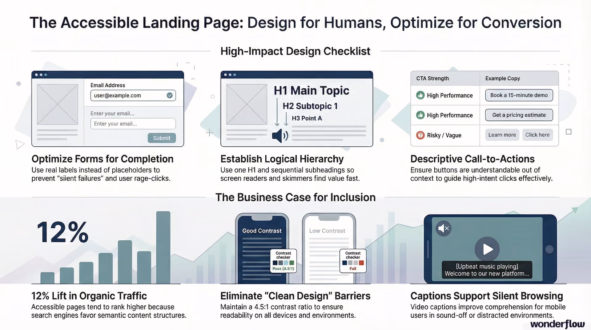
1. Content hierarchy that screen readers and humans can scan
- Use one clear H1, then logical H2s and H3s (don't skip levels)
- Keep sections short and use bullets where they genuinely help
- Put the "why this matters" line early in each section (people skim—give them a reason to stay)
- Make sure the visual order matches the DOM order (this matters for screen readers and keyboard users)
Why it helps conversions: Visitors find the value prop faster and commit sooner. Clear heading structure also gives search engines better signals about your page content—one of the underappreciated web accessibility SEO benefits.
2. Accessible CTA design (and why "Learn more" quietly hurts you)
A CTA should be understandable out of context. Screen reader users often navigate by links and buttons, which means vague CTAs become meaningless when pulled out of the surrounding text.
Strong examples:
- "Get a pricing estimate"
- "Book a 15-minute demo"
- "Download the accessibility checklist"
Risky examples:
- "Learn more"
- "See all"
- "Click here"
Why it helps conversions: More clarity leads to higher-intent clicks, fewer misclicks, and less hesitation. This ties directly into how your full funnel is structured—vague CTAs at any stage bleed out qualified leads.
3. Accessible form design (the biggest conversion lever)
Forms are where accessibility issues become direct revenue loss.
Make sure:
- Every input has a real
<label>element (not just placeholder text) - Required fields are indicated with text, not color alone
- Error messages appear in text, near the field, and explain the fix
- Focus moves to the error summary or first error on submit
- The entire form works with keyboard-only navigation
- CAPTCHA doesn't block real users (use accessible alternatives like honeypot fields or invisible reCAPTCHA)
Why it helps conversions: Fewer "silent failures," fewer rage-clicks, more completions. If you're already focused on eliminating funnel leaks, accessible forms are one of the fastest fixes.
4. Color contrast (where "clean design" backfires)
Low-contrast UI is one of the most common landing page issues—especially on modern minimalist pages.
- Body text needs strong contrast against the background (WCAG recommends a minimum ratio of 4.5:1 for normal text)
- Placeholder text should never be the only way someone knows what to enter
- Don't rely on color alone for success or error states
- Ensure focus outlines are visible—don't remove them for aesthetics
This is where "looking premium" can unintentionally become "hard to read." Use a free tool like the WebAIM Contrast Checker to test your palette in under a minute.
5. Alt text and media that works in the real world
- Provide alt text for meaningful images (skip the "image of…" prefix)
- Decorative images should have an empty
alt=""attribute - Avoid images-of-text; use real, selectable text whenever possible
- Videos should have captions; avoid autoplay with sound
This doesn't just support accessibility—it supports comprehension in sound-off, mobile, and distracted environments. That's a huge chunk of your actual audience.
Bonus: web accessibility SEO benefits
Accessibility and SEO overlap more than most teams admit. Headings, semantic structure, descriptive link text, alt text, and mobile usability all help search engines interpret your content more accurately.
Some studies report measurable organic traffic lifts after accessibility improvements. One large-scale analysis found an average 12% increase in organic traffic following implementation of accessibility solutions. (Source: accessiBe / SEMrush data) Results vary by methodology and implementation, but the directional signal is consistent: accessible pages tend to perform better in search.
Treat SEO benefits as a bonus rather than the primary goal—but it's real enough to factor into your business case.
Global compliance pressure isn't limited to the ADA
Section 508: If you sell into government or education in the U.S., Section 508 compliance comes into play—especially for digital products and services. (Source: Section508.gov)
European Accessibility Act (EAA): If you sell into the EU, the EAA has been a major forcing function. The European Commission describes it as a directive to harmonize accessibility requirements across products and services—with June 28, 2025 widely referenced as a key compliance date for covered services.
The takeaway: accessibility requirements are moving in one direction—toward stricter expectations, not looser ones.
A practical way to start: the 30-minute landing page accessibility audit
If you want the fastest path to finding something that's costing you conversions, try this:
- Keyboard-only test: Can you reach every control, fill the form, submit, and recover from errors—without touching your mouse?
- Zoom to 200%: Does anything overlap, disappear, or become unusable?
- Contrast scan: Can you comfortably read body text and labels on mobile?
- CTA clarity check: Do buttons make sense without the surrounding text?
- Form failure check: Do errors explain what to do next, in text?
You'll almost always find at least one high-impact fix. And these checks don't require any special tools to start—just a keyboard, a browser, and 30 minutes.
Where Wonderflow fits in
If you're running paid campaigns or relying on landing pages for lead gen, accessibility is one of the best "under-the-hood" optimizations you can make. It improves conversion rates, reduces funnel drop-off, and strengthens your compliance posture at the same time.
At Wonderflow, we treat landing page accessibility like conversion work—because that's what it is:
- Audit pages against practical WCAG 2.2 expectations
- Fix form, CTA, contrast, and keyboard navigation issues that block conversions
- Improve content hierarchy and clarity without redesigning your brand
- Deliver a prioritized roadmap so engineering and design aren't guessing
Performance and accessibility baked in is how we build every Webflow site—not as a line item, but as part of how the system works.
.jpg)
.avif)
.avif)